What a sleepy morning after the FLOOR DECORATION!
But I persist in attending this lesson since I know this would be interesting.
And, It is.
Door design, lift design, word of sign...
Those are the things that we could always see in our dairy life.
And we could always "trick" by those door.
But we would never find out the reason WHY a door can "trick" us like that.
Not only door, but also other product, should be user-friendly.
This is he most important part in design.
And also, the most difficult part.
Begin to write my photo Lexican.
Don't wanna mass it up by my bad handwriting.
So, COMPUTER please!
2009年9月29日 星期二
2009年9月23日 星期三
Bossini Logo
Back to hall and started to surf at Tommy Li and Alan Chan's web site.
I find out that many of the famous branding designs are done this these two guys.
One of the Icon that I find out is interesting, is the Bossini icon, designed by Alan Chan.
This is the logo from his web site.
There is a green "B" on it, with the technique of reification.
apart from the "B", it looks like a lamp, which perhaps representing something in daily life.
Moreover, for me, the whole icon looks like a alien with a helmet, representing something special?
No matter what it is representing. Today, I do have the chance to look deeply into some icon that I can always see in the street.
It's a great experience and I feel GOOD in doing so!
2009年9月22日 星期二
The third week
Amazing morning.
Study some of the theory about digital graphic communication.
In fact, we do know some of the theory by our common sense.
But we do not know what is the exactly wording representing that concept.
This lesson is great that I learn more about what we use (or see) in our dairy life about graphic.
There is one thing I want to mention- The comparison between the two designers' work.
the Maxims' icon, the One2free icon, e.t.c.
In fact, I have never noticed that the Maxims' icon is made by heart.
In my view, it is just an icon with something brusting out.
Perhaps it is due to the fact that this icon is too common in Hong Kong and we seldom spend time on it.
This do remind me one thing- people always miss the thing that they think that they are familiar with.
Not just icon that is common, but also our families, friends, opportunities...
There is one thing we need to bear in mind: treasure the thing that we already have and do spend time with them.
It's time for my lesson. Continue later!
2009年9月10日 星期四
My first entry
I begin to foret things easily.
I forget the promise to the others.
I forget the dating with the others.
I forget what should I do.
Oh my god!
every time when I attend the DGC class.
I feel excited since it seems that my relationship with graphic become closer.
After taking BBA at university. I seldom have oppotunity to work with graphics/ design e.t.c.
Only when I attend the DGC class.
I could feel that I am learn the things that I really like.
I need to work hard on that.
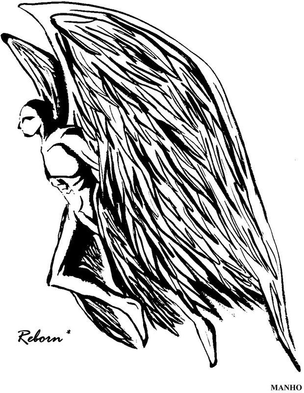
it is a work from my previous portfolio.
And I have done some modification recently in order to clearify the black and white colour.
In fact, this picture do have another two with the same series.
representing a evolution of the character.
However, since it is a work when I was F.5. It is not quite mature when I see them now.
by the way, I do wanna know more about DGC in this year in order to boarden my horizon!
訂閱:
意見 (Atom)